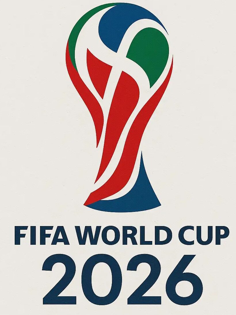
The FIFA World Cup is more than just the biggest football tournament in the world. Every four years, it brings together nations, cultures, and millions of passionate fans under one global event. Along with the excitement on the pitch, each tournament introduces a new visual identity that represents its unique character. The FIFA World Cup 2026 logo is one of the boldest changes FIFA has ever made. Unlike previous editions that featured colorful illustrations inspired by the host country, the 2026 logo embraces a clean and modern style centered around the iconic FIFA World Cup Trophy and the number “26.”
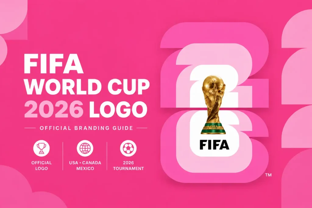
When FIFA officially unveiled the logo in May 2023, it immediately became one of the most talked-about football designs in recent years. Some fans admired its simplicity and flexibility, while others believed it lacked the artistic creativity seen in earlier World Cup logos. Regardless of differing opinions, the emblem marks a new chapter in FIFA’s branding strategy and reflects the modern digital age.
Visit World Cup Standings here
When Was the FIFA World Cup 2026 Logo Revealed?
The official FIFA World Cup 2026 logo was unveiled on May 17, 2023, during a special launch event in Los Angeles, California. The ceremony brought together football legends, FIFA officials, celebrities, and representatives from the three host nations—the United States, Canada, and Mexico.
During the event, FIFA also introduced the tournament’s official campaign slogan, “WE ARE 26.” The slogan was designed to celebrate everyone involved in the tournament, including players, supporters, volunteers, host cities, and football communities around the world. Unlike previous World Cups that focused mainly on the host nation, the 2026 branding was created to unite three countries under one global identity.
Why FIFA Chose a Completely Different Design
For decades, FIFA World Cup logos were known for their artistic style. The Brazil 2014 logo featured hands lifting the famous trophy, while Russia 2018 combined traditional Russian artwork with the World Cup Trophy. Qatar 2022 used a flowing infinity-inspired design influenced by Middle Eastern culture.
Instead of following the same creative path, FIFA decided to simplify everything for 2026. The organization wanted a logo that could work equally well on television broadcasts, social media, mobile applications, merchandise, stadium screens, and digital platforms. Since the tournament is being hosted by three different countries and sixteen host cities, FIFA needed a design system that could easily adapt to different cultures without losing its identity.
The result was a minimalist logo that focuses on football’s greatest symbol—the FIFA World Cup Trophy.
Who Designed the FIFA World Cup 2026 Logo?
Unlike many previous World Cup tournaments where a single designer received public recognition, the FIFA World Cup 2026 brand identity was developed through collaboration between FIFA’s internal creative department and international branding specialists.
Several creative agencies contributed to the launch campaign, visual identity, and presentation experience. Rather than creating one static logo, the design team built an entire branding system that allows every host city to create localized versions while keeping the official emblem recognizable around the world.
This flexible approach reflects modern branding trends, where logos need to perform across digital media, large-scale events, and global marketing campaigns.
Understanding the Design of the Logo
At first glance, the FIFA World Cup 2026 logo appears very simple. However, every element was carefully chosen to represent the tournament’s identity.
The most important feature is the official FIFA World Cup Trophy placed directly at the center of the design. Instead of using an illustrated version, FIFA chose to display the real trophy. This instantly connects the logo with football’s greatest achievement and makes it recognizable to fans everywhere.
Behind the trophy sits the bold number “26,” representing the year 2026. The large typography creates a modern appearance while ensuring the logo remains highly visible on both small mobile screens and massive stadium displays.
The clean white background allows the trophy and typography to stand out without unnecessary decorative elements. This minimal design also makes it easier to adapt the logo for different marketing materials and promotional campaigns.
The Meaning Behind the FIFA World Cup 2026 Logo
Although the logo looks simple, it carries several important messages.
First, it places football itself at the center of the tournament. By highlighting the official World Cup Trophy instead of cultural artwork, FIFA reminds fans that the competition remains the heart of the event.
Second, the logo represents unity between three host nations. The 2026 FIFA World Cup is the first tournament in history to be hosted jointly by the United States, Canada, and Mexico. A clean and adaptable logo allows each country and host city to express its own personality while remaining connected to one official tournament identity.
Third, the logo reflects the future of global sports branding. Modern logos must work across websites, television graphics, social media posts, streaming platforms, mobile applications, and merchandise. The minimalist approach ensures the design remains effective everywhere.
The Official Color Scheme
One of the most interesting aspects of the FIFA World Cup 2026 branding is its flexible color system.
While the official logo often appears in black and white, FIFA developed a broader visual identity inspired by the colors of the three host countries.
Blue and white represent the United States.
Red and white reflect Canada’s national identity.
Green, white, and red celebrate Mexico’s national colors.
Instead of limiting the tournament to one fixed palette, FIFA allows different promotional materials and host cities to incorporate their own local colors while maintaining the official logo.
This approach gives every city a unique visual identity while keeping the overall tournament branding consistent.
Typography and Modern Branding
Typography plays an important role in the FIFA World Cup 2026 logo.
The bold sans-serif numbers create a modern, confident appearance. The simple lettering improves readability and works well across all digital devices. Whether the logo appears on a smartphone screen, television broadcast, billboard, or football jersey, the typography remains clear and recognizable.
The minimal style also reflects current design trends used by major international sporting events and global brands.
Why the Logo Created So Much Debate
Few World Cup logos have generated as much discussion as the FIFA World Cup 2026 emblem.
Many designers praised its clean appearance, flexibility, and ability to perform across different media platforms. They argued that modern branding requires simplicity rather than excessive detail.
Others believed the logo lacked creativity and emotional storytelling. Previous World Cup emblems often celebrated local culture through artistic illustrations and symbolic elements. Critics felt that replacing those designs with a simple trophy and number removed some of the tournament’s traditional personality.
Despite these opinions, FIFA explained that the surrounding visual identity—including host city artwork, campaign graphics, and promotional materials—would provide the cultural expression that earlier logos contained within a single emblem.
How the 2026 Logo Differs from Previous FIFA World Cup Logos
The FIFA World Cup 2026 logo represents one of the biggest visual changes in tournament history.
Earlier World Cups featured custom illustrations inspired by local culture, architecture, or national traditions. The 2026 edition moves away from those artistic styles and instead focuses on flexibility, simplicity, and global recognition.
Rather than designing one decorative logo, FIFA created an adaptable identity system that allows every host city to personalize the tournament while preserving a consistent global brand.
The “WE ARE 26” Campaign
The official slogan “WE ARE 26” is closely connected to the logo.
Instead of celebrating only football players, the campaign recognizes everyone who contributes to the tournament. Fans, volunteers, host cities, local communities, broadcasters, sponsors, and participating nations all become part of the FIFA World Cup story.
The slogan reflects the idea that the tournament belongs to the entire football community rather than a single country or organization.
Why the Logo Will Be Remembered
Whether fans admire the design or prefer previous World Cup logos, there is little doubt that the FIFA World Cup 2026 emblem represents a significant moment in football history. It introduces a new branding philosophy focused on flexibility, digital compatibility, and global consistency.
As the first FIFA World Cup featuring 48 teams and hosted across three nations, the tournament required a visual identity capable of representing an event unlike any before it. The minimalist logo may appear simple, but it symbolizes a competition that is larger, more connected, and more international than ever before.
When football fans look back at the FIFA World Cup 2026, this logo will be remembered as the symbol of a tournament that embraced a new era of global football while redefining how the world’s biggest sporting event presents itself to future generations.